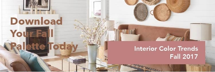



2018 Interior Color Trends: Bold or Timeless?

2018 interior color trends

Goodbye, pastel tones! Every year we love pulling our favorite interior color trends and (even better) seeing how you use them in your projects! From timeless neutrals and eye-catching light-reflective pearls (our favorite), to saturated bold tones… scroll through to see our favorite 2018 interior color trends.

Go Bold

Pastel tones had their time in the spotlight the last few years, and to nobody’s surprise here at Scuffmaster, 2018 is the year for bold colors. Bold saturated tones don’t always have to mean a statement making accent wall; try combining bold tones as your neutrals in your upcoming design projects.
2018 interior color trends

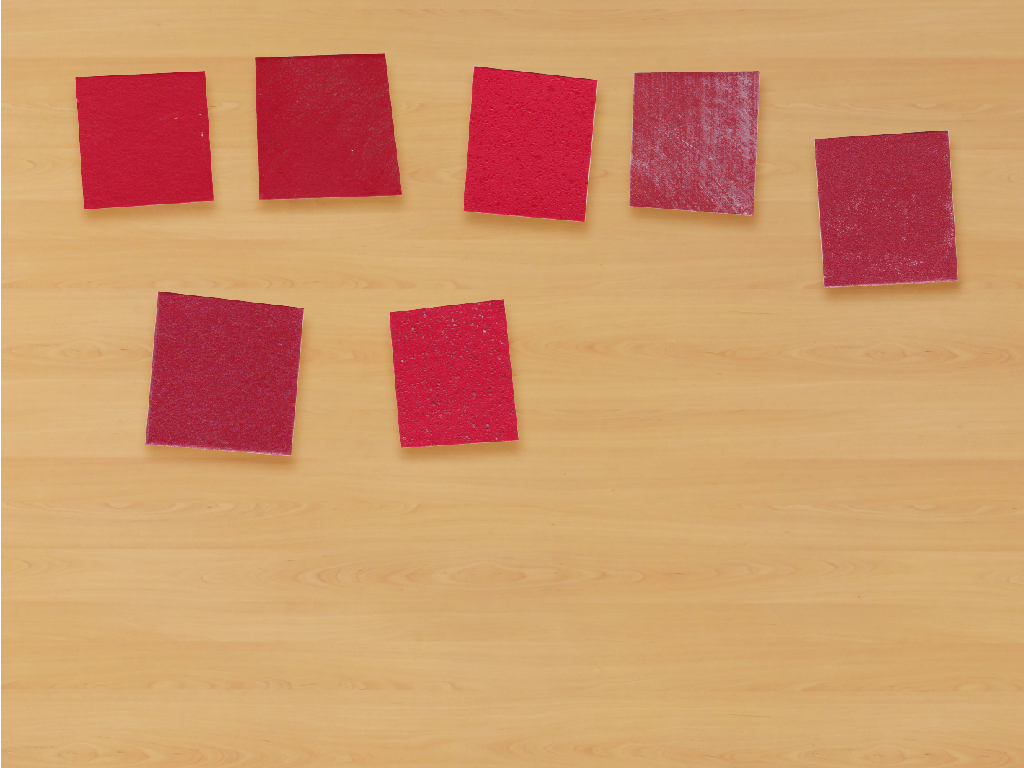
Choose a cheerful, warm and bright lipstick red to drape your walls in one of 2018’s hottest interior color trends. Take it one step further and try this saturated hue in a metallic specialty finish or an interesting texture to finish your design.
2018 interior color trends

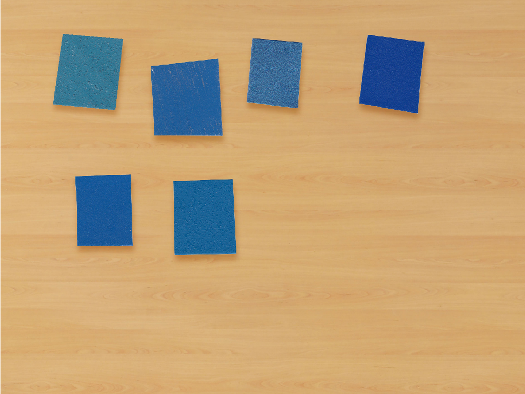
Blue is EVERYWHERE right now and will continue to be deep into 2018! You may have noticed that everything at NeoCon was blue, blue and (you guessed it) blue! From teal and navy to deep shades of Ocean Blue your options are limitless with this trend.
2018 interior color trends

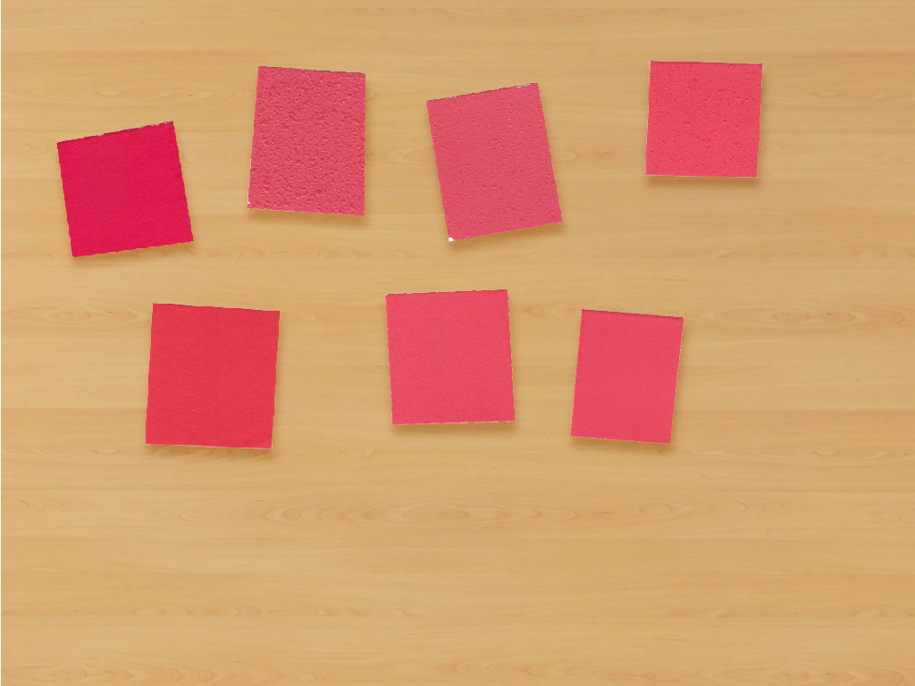
Pink is a hard sell. BUT pink tones (in nearly every market) are hitting it big with millennials. Millennial pink, anyone? Dusty blush and rose have been the most popular colors to take over the market for the last couple of years, so this bright poppy pink has laid some great ground work.
2018 interior color trends

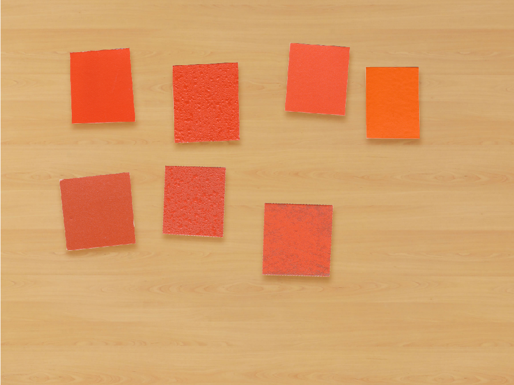
We’ve seen styles from the 70’s creeping their way back into popularity for the last several years; from the runway and fast fashion, to beauty and, of course, interior design. Say hello to this lovely saturated tangerine tone. Splash this color on the walls of your designs in 2018.
2018 interior color trends

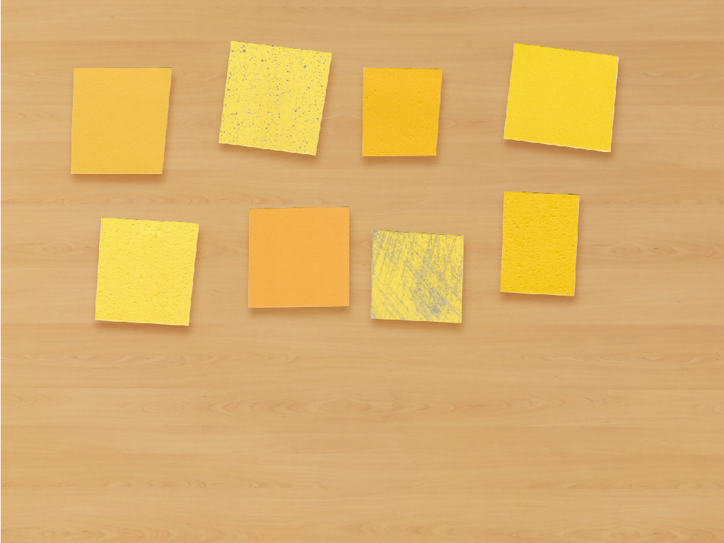
Hello, pop tones. While bright pink threatens the popularity of the dusty blush tones of the last several years and tangerine orange makes a comeback, it’s not often that we see a bright sunshine yellow. We love to see this hue popping up on the color trends for 2018. Let’s make 2018 cheerful with this sunshine yellow!

Timeless Neutrals

I mean, who doesn’t love the classics? You really can’t go wrong with timeless neutrals on projects you just don’t want to push the boundaries on.
2018 interior color trends

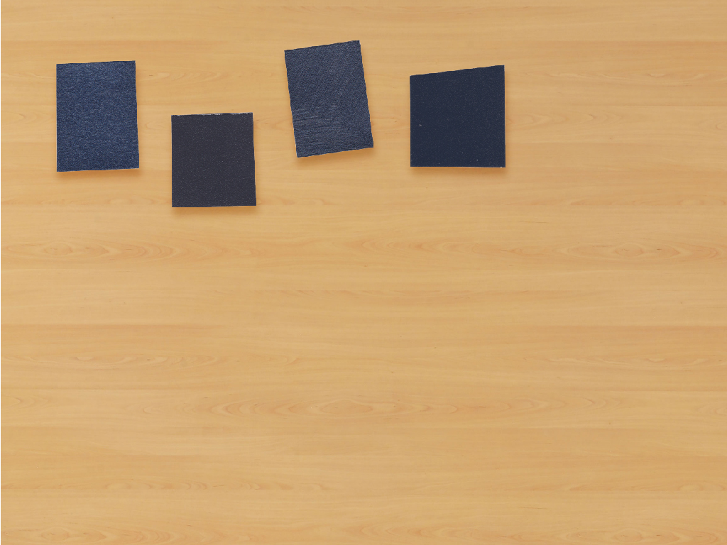
The ever trust-worthy and timeless navy, how we do love you! There’s something so chic and (dare we say it?) sexy about a good navy. Splash your lobby, corridors, guest rooms, EVERY WALL YOU CAN FIND in a beautiful and timeless navy. You won’t be disappointed.

Trend-setting Pearls

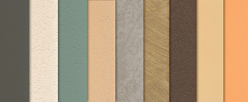
By far our favorite 2018 interior color trend is pearl tones. Eye-catching light-reflective pearlescent tones can completely change a room and create beautiful effects when paired with lighting.
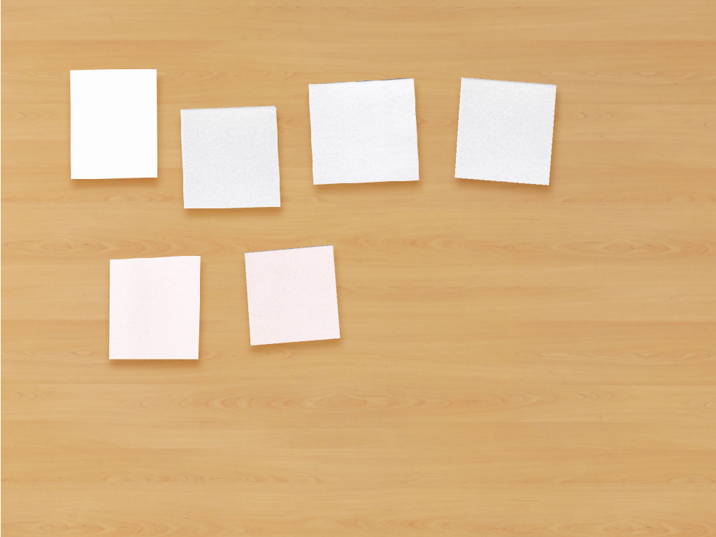
2018 interior color trends

Keep it classic with pearly whites or switch it up a little bit with neutrals in a pearl finish that sparkle. Get your hands on some pearl samples to really see the difference these finishes can make in your projects (you just can’t see the light reflective qualities in photos!).
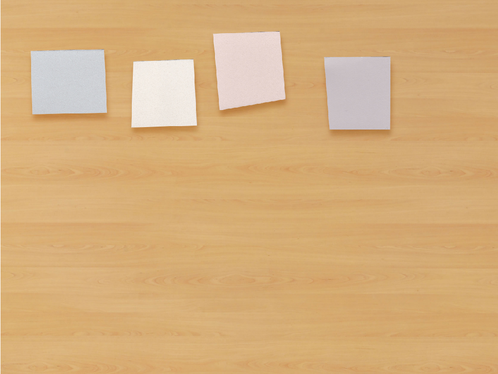
2018 interior color trends

Chic Black

In fashion, black never goes out of style. We love black for interiors right now. Chic black is one of the biggest 2018 interior color trends and we’re definitely sticking around for it. Try a rich black or charcoal in your space with comfortable textures to make this trend come to life.
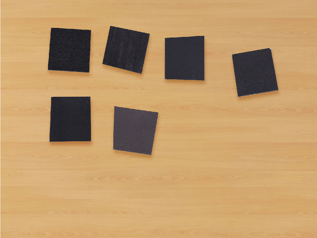
2018 interior color trends

Muted Tones

Muted tones have been big for the last couple of years, especially when it comes to pink tones. Millennial Pink still hasn’t stopped trending (seriously, we see it everywhere), but this year we’re really digging into these mauve tones that have been popping up over the last year. We really see mauve sticking around in 2018, too. Is 2018 going to be the battle of the pink tones?
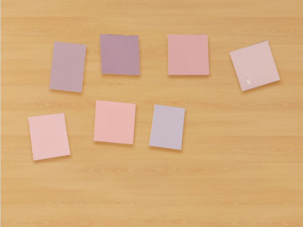
2018 interior color trends

2018 interior color trends

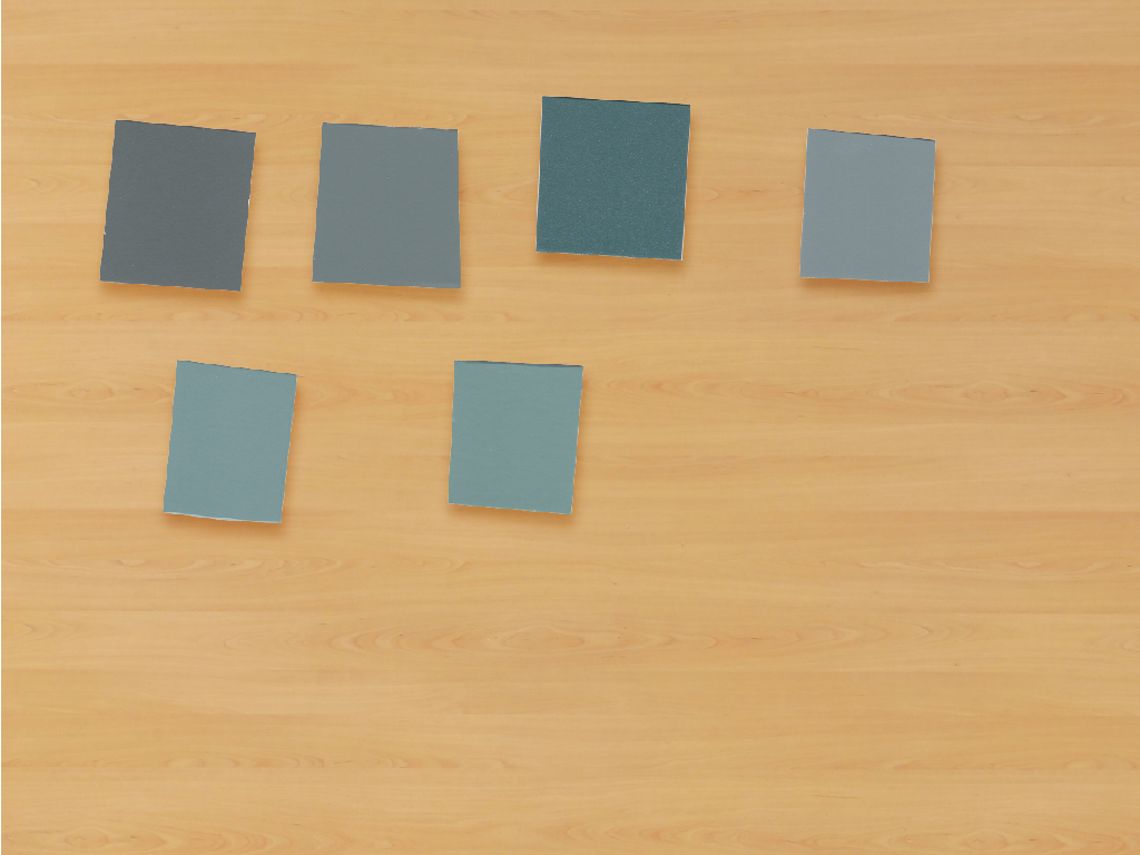
Muted gloomy blues and greens always bring a nice calming effect to a space, a trend that we see becoming prominent in 2018. We could all use a space to feel calm, right?
2018 interior color trends

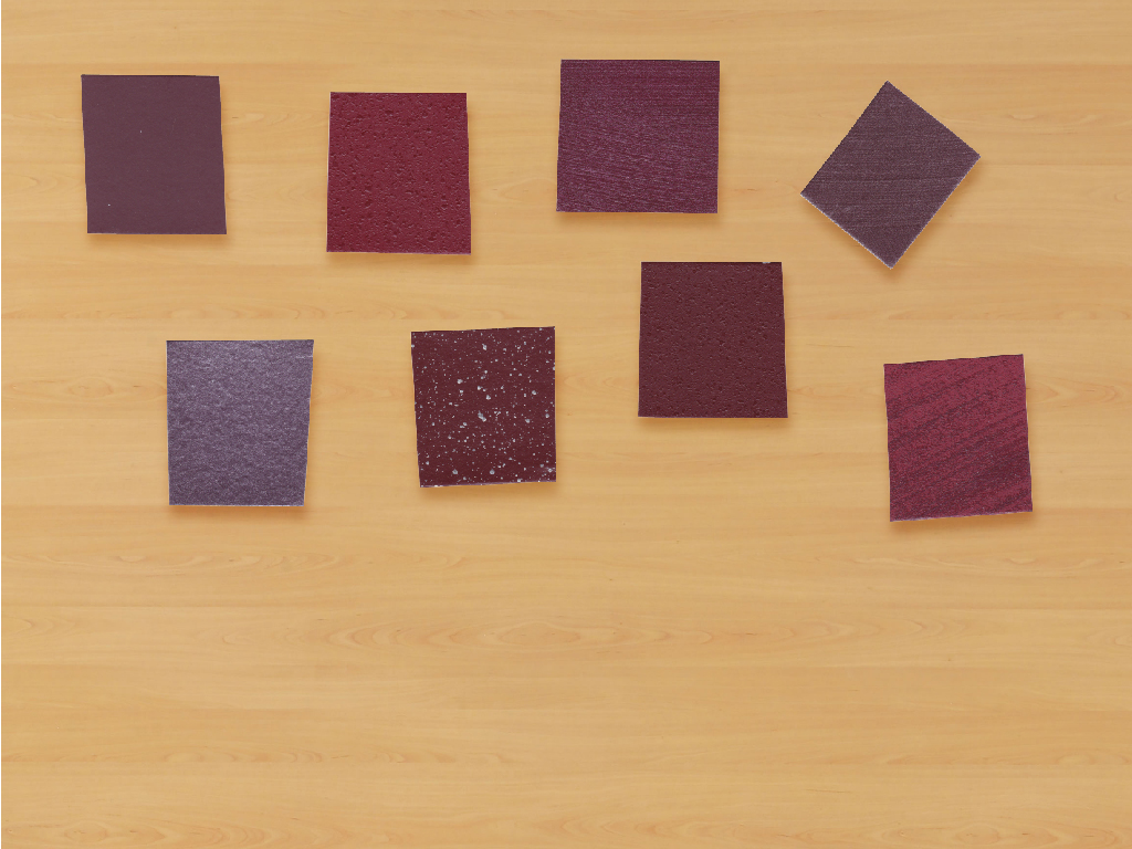
Deep pomegranate and burgundy tones have been popping up on the runway and are going to carry over into interiors. These warm tones can make a space feel very cozy, and with Hygge still taking the world by storm we definitely see a lean towards cozy interiors throughout 2018.

Neutral Metals

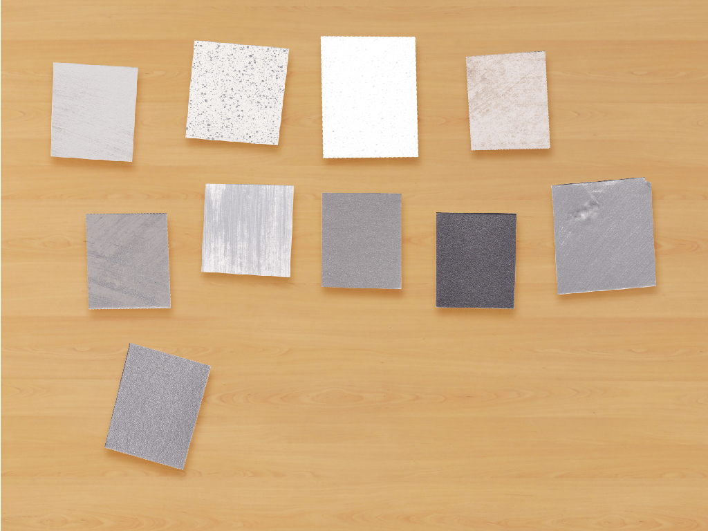
Metallic specialty finishes have always been a favorite here at Scuffmaster, so it’s probably easy to see why neutral metals made it on our list of top 2018 interior color trends. With a range of metallic finishes that have been popular with designers for years, we can totally see how neutral metals are going to have their time in the spotlight (no pun intended, but they mix very well with specialty lighting) in 2018.
2018 interior color trends

Get your own palette of 2018 interior color trends (with real samples!) for free right here.
2018 interior color trends palette

Top 10 2017 Interior Color Trends For Fall

Millennial Pink, blush, camel, navy… What are the hot 2017 interior color trends for fall? Luckily for you, you don’t have to twist our arms too much to get us to dish on all the trending colors and styles for the upcoming season.

1. Crisp White

This isn’t a surprise to any of us. If you’re a designer you know you can always count on white to complete your interior projects. From white as a calm and soothing neutral to white as a bold accent, we don’t think this trend is going away.

2. Lipstick Red

Bold and beautiful, red is BIG for this coming fall. Unlike the reds of falls past, this year we’re going to see more pure reds instead of the more subdued burgundy toned reds common in fall interior designs.

3. Millennial Pink and Blush

No surprise here, either! Millennial pink has taken the world by storm and it’s not ending anytime soon. Try incorporating some Millennial pink or blush as neutrals in your interior designs. Can we even call this a fall 2017 color trend if it’s been the #1 trend for awhile?

4. Prints

Bold prints are still big for fall. Tropical prints and bold florals (remember your grandmas couch?) are going strong. Try pairing them with a coordinating bold paint to really make your designs pop.

5. Hygge

Have you heard of Hygge yet? Chances are, you have. Hygge is the Danish inspired decor of “cozy living”. Incorporate comfortable rich textures and fabrics, with warm cozy colors into your designs to bring Hygge into your spaces.

6. Black Is The New Black

Go BOLD with a rich black as an accent in your designs. Want to go really bold? Try putting it on the ceiling (you know, that space that everybody neglects). Take it up an extra notch with a semi-gloss black to really make a statement, try ScrubTough Max for a durable semi-gloss black.

7. Velvet

Velvet, velvet, velvet. You’ve seen it from the runway to Target to chaise lounges… Velvet is still going strong. Perfect for the Hygge trend, velvet furniture is big for fall 2017. Mix velvet furniture with deep on trend jewel toned paint to finish your space.

8. Glitter

Yes, glitter. We’re not high, promise. We’re not sure if this started with the Unicorn obsession or high fashion, but we’re not complaining. Try splashing some glitter on your walls with a specialty paint (our Smooth Pearl finish does this in a chic way). I have to imagine this is Paris Hilton’s favorite of the 2017 interior color trends.

9. Green

Pantone called it again. Green is going strong into fall 2017 as one of the hottest interior trends. From deep greens to cheerful tropicals, this trend is one not to miss. Try a metallic green for an extra pop.

10. Chocolate

We don’t mean the sweet and tempting snack… though we’re pretty sure that’s always trending. Chocolate brown (remember that lipstick from the 90’s?) is back for fall 2017 from fashion to interior spaces. We can see chocolate really taking off in your designs this year.

What’s Your Favorite 2017 Interior Color Trend?

What are your favorite trends for fall 2017? Millennial Pink and Hygge are definitely top contenders on my list for favorite 2017 interior color trends. Download our palette below to take these trends with you on the go for all of your interior design projects!

2017 interior color trends fall '17 palette

2017 Color Of The Year – Greenery

By now we’ve all seen and heard about Pantone’s pick for 2017 Color Of The Year. We love the pick of Greenery for new beginnings in 2017. As an environmentally friendly paint brand (powered by solar panels, in fact!) we also value the environmental aspect in the choosing of their color Greenery for 2017. We hope Greenery has inspired you as much as it has inspired us.

Get your 2017 Color Of The Year collection matched in all of Scuffmaster’s finishes for free right here!

Did you know that there are more shades of green visible to the human eye than any other color? “Flourishing foliage and lushness of the outdoors” is one of the many inspiring factors that lead Pantone to choose Greenery as 2017 Color Of The Year. Our favorite thing about the pick of greenery is the intersection it creates between indoors and outdoors. We love to see the outdoors brought into your interior designs. Lush living walls? Yes please! Indoor office gardens? Sign us up. Shelving filled with potted plants? How charming.

A positively revitalizing shade with health benefits (reduces anxiety, paint your office green!), Greenery lifts us up even when the world is in its darkest moments. Green is a color of hope and passion; when nature’s greens revive, so do we. There’s nothing quite like the hope and optimism restored to the mid-westerner come springtime when the grass starts to grow and the trees and flowers start to bloom after a long and dreary winter season. Greenery captures that optimism.

We think you should definitely paint some spaces green in 2017. After all, green has been shown to reduce anxiety and be the best color for your workspace! Get your 2017 Color Of The Year collection matched in all of Scuffmaster’s finishes for free right here!

2017 Color Trends: Our Favorite Colors For Interiors

It’s that time of year again – time for all of your favorite paint companies and color labs to choose their favorite 2017 color trends. Color us excited.

We put a ton of effort into researching our favorite color trends each year; inspired by images across the world, runways, interiors new and young, and (of course) nature. Every year we make sure our collection is full of beautiful rich colors that can stand the test of time (nobody wants to paint a 3000 sqft. project with a color that is going to be dated in 2 years). Scroll through to see some of our picks for 2017 color trends.

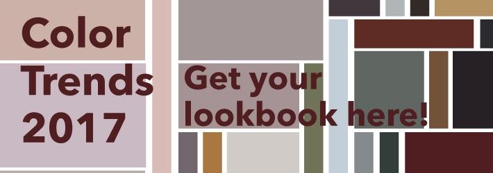
Get our 2017 color trends lookbook here.

This hint-of-blush is the perfect tone to use when looking for a soft neutral. We definitely saw this color coming when we chose a similar shade for our Fall ’16 colors.

Do beautiful rich gold tones ever go out of style? We’re loving this shade for 2017. Try it out in a bold metallic finish.

Pearly whites are the go-to for many designers, and for good reason. This year we see white becoming more of an accent, with dusty blush tones being used more for neutral areas. Check out some great pearl whites here.

This deep chocolate with a hint of red tone is a gorgeous deep neutral, adding some rich color to your interiors.

You may have seen by now that Pantone’s Color of The Year is Greenery. Whilst not as bright, we are also feeling inspired by nature and the changing world around us for 2017. A deeper, more subdued shade of green is on our list for this coming year. This beautiful olive can almost get away as a neutral tone. How will you use it?

By the way – did you know humans can see more shades of green than any other color?

This deep merlot has some staying power; it’s sure to be a classic and has us asking for another glass of wine (yes, please!).

Deep rich shades combined with soft tones are our go-to combinations for 2017. This evolved shade of a deep emerald with a cool blue tone is one of our favorites in this collection. We can’t wait to see how you use it.

Find our colors from this palette here.

This is only HALF of our palette for 2017 color trends. Check out the rest in the lookbook below! We can’t wait to see how you combine these colors.


Color Trends 2017 LookBook


Success! Metallic Paint In Commercial Interiors

Metallic paint in commercial interiors on ceiling

Recipe For Success: Metallic Paint in Commercial Interiors

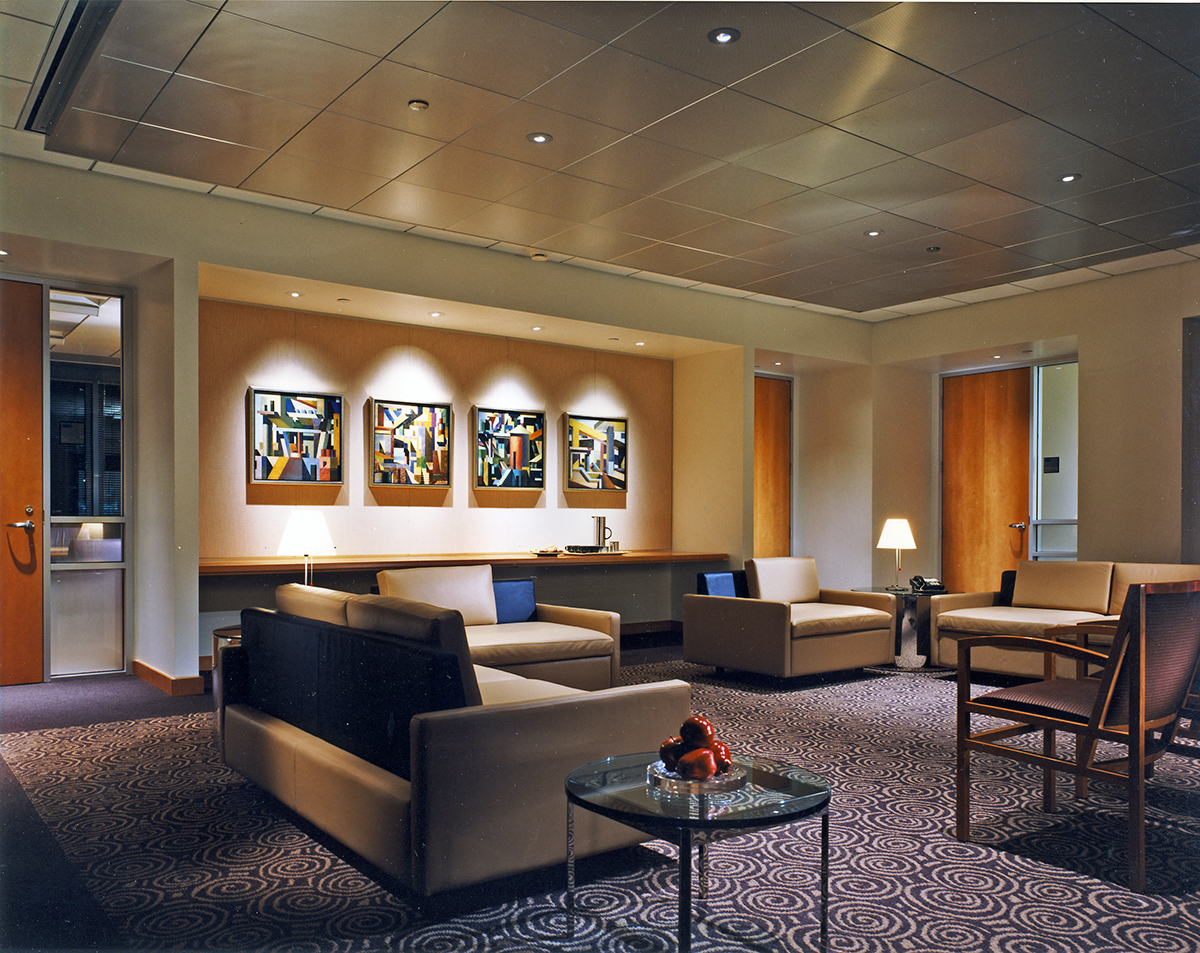
Commercial interiors are more than white walls, fiddle leaf figs and re-pins on Pinterest. They take your blood sweat and tears to achieve perfection (or your client’s idea of perfection). Our favorite commercial interior designs pack a punch with metallic paint. Scroll through to see some convincing reasons why you should choose to put metallic paint in commercial interiors.

example of metallic paint in commercial interiors

Metallic Paints In Commercial Interiors

Metallic paints in commercial design are a recipe for success. Timeless and elegant or bold and trendy; Metallics can make as much or as little a statement that your commercial designs need. Check out some of our favorite designs featuring metallic elements.

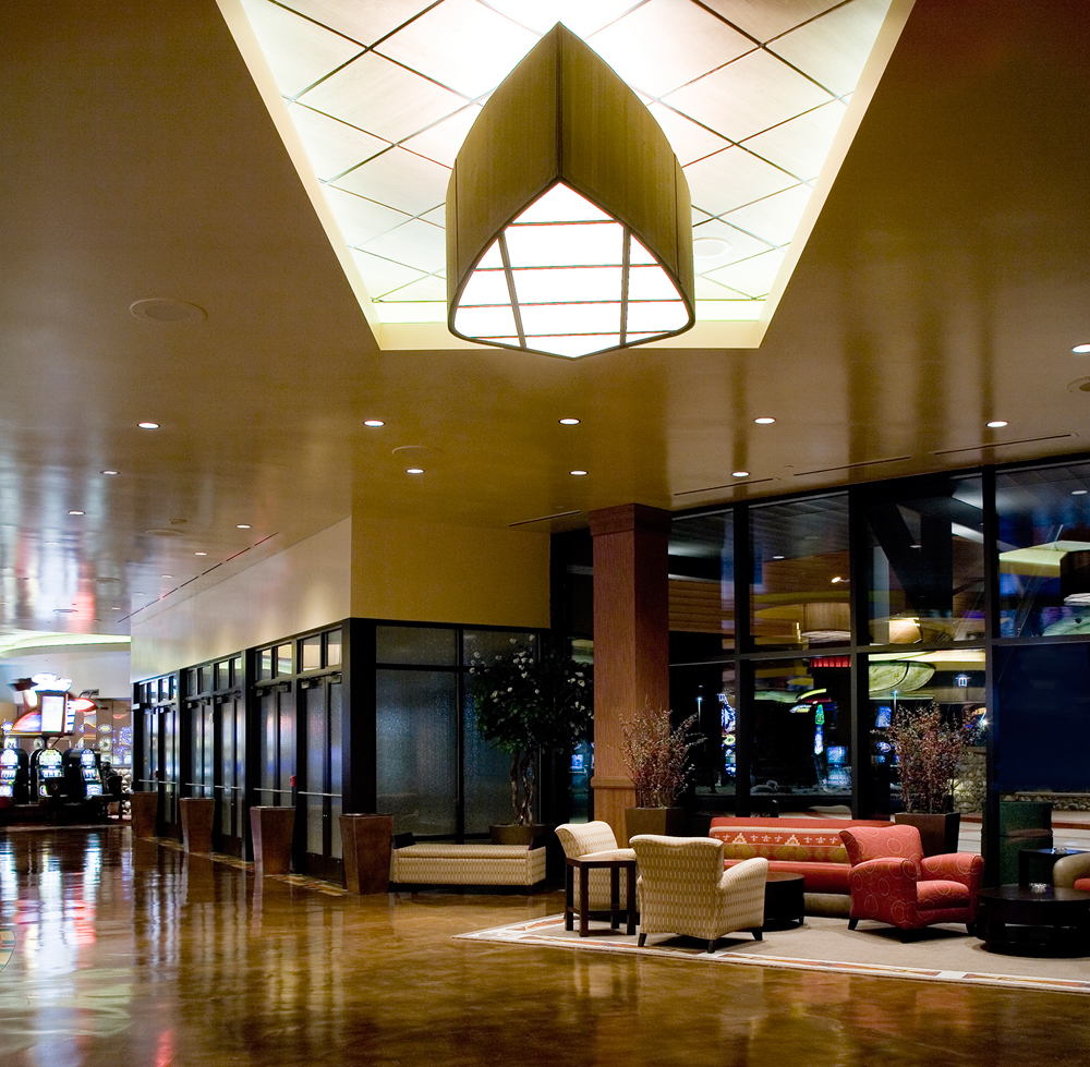
Metallic paints can fit in with your designs or stand out as much as you need. From covering all walls in beautiful metallic paint to selecting a few accent walls or architectural features, there’s a place in nearly every project for a metallic paint. Need something a little unexpected? Don’t stop at the walls, try a metallic finish on the ceiling for a unique touch.

Pair your metallic walls with a metallic ceiling and metallic finishings like pendant lighting and shelving!

Metallic paints pack an extra punch in commercial interior designs where eggshells would fall flat (literally). This is one of the many benefits of specifying a specialty paint like a metallic finish. Add dimension and flair to your designs with a metallic paint that would catch anyone’s eye.

Metallic paint in commercial interiors on ceiling, walls and columns

Get Ideas For Your Commercial Designs

Think your commercial interior design could use a metallic paint? We think so too. Check out our lookbook on designing commercial interiors with metallic paint below, or check out our finishes to find beautiful metallic finishes in a huge range of colors here!

metallics-lookbook

Current Paint Trends: Fall Color Report

Seasons come and go, and with them, the “it” colors of the moment. (You can see more of our thoughts on ‘color of the year’ and such here.) We like to find trending colors that can last awhile, so your designs can live on walls without feeling dated 3 months later.

Get our free Fall ’16 Interiors LookBook here!

We’re constantly watching color trends across the globe. From interiors to fashion to technology to Pantone’s color report, we have an eye on it all. Scroll through to see our favorite current trending paint colors to splash on your walls for fall 2016 and beyond.

Not sure how to use these in your commercial designs? Download our free Fall ’16 Interiors LookBook below!

Get Your Fall '15 Trends LookBook


The Colors of the Olympic Rings

The Colors of the Olympic Rings

The Olympics are one of the most recognized (and protected) brands in history. The signs, songs, and symbols of the Modern Olympic games stir the emotions of people on every continent. And while competition is at the heart of the Games, the design of the Olympic symbols was driven by a spirit of unity.

Check out our colors of the olympic rings.

Considered the father of the Olympic Games, Pierre de Fredy, Baron de Coubertin was a French educator, historian and founder of the International Olympic Committee. A bit of a polymath, the modern Olympic Games are the international spectacle that they are because of Pierre de Coubertin and his dedication to uniting people through sport.

What do the rings mean?

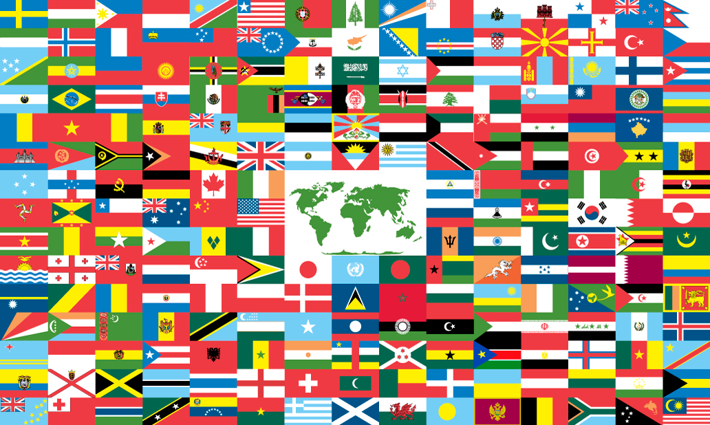
The 5 rings might be the most well known symbol in the world. But what do they actually stand for? And how were the colors chosen? Created in 1912 by Pierre de Coubertin the five interlocking rings originally represented the 5 world continents: Africa, Asia, America, Europe and Oceania. Laurel or olive wreaths were popular decorative elements in the 19th century and were said to be handed over by goddesses of victory. It is expected that these wreaths and the goddesses of victory were inspiration for the ring motif. This symbol of interlocking rings was meant to symbolize the union of the five continents of the world coming together to watch as their best athletes compete at the Olympic Games.

The 6 colors of the olympic symbol

Flags

Coubertin says in an April 1927 issue of Messager d’Athenes:

“The great Olympic flag is hoisted up the same pole that it is to remain on for the duration of the Games. It was criticized when I designed it. Today everyone likes it. It is white, as you know with five interlinked rings, blue, yellow, black, green, red, representing the five parts of the world united in Olympism.”

Officially debuted at the Games of the VII Olympiad in Antwerp in 1920, the rings also represented all 6 color combinations of every country’s flags without exception (in regard to the year 1913).

Although no ring is meant to symbolize a continent or country exactly, the combination of them covers all countries. On it’s debut, Coubertin stated in August 1912’s edition of Olympique:

“…the six colors (including the flag’s white background) combined in this way reproduce the colors of every country without exception. The blue and yellow of Sweden, the blue and white of Greece, the tri-colors of France and Serbia, United Kingdom of Great Britain and Northern Ireland, America, Germany, Belgium, Italy and Hungary, and the yellow and red of Spain, are placed together with the innovations of Brazil or Australia, with old Japan, and with new China. Here is a truly an international symbol.”

The rings today

It is to be noted that the colors are not intended to refer to a continent specifically, more so represent each possible combination of participating countries’ flags. If you ignore the varying shades of blue, red, green and yellow seen across modern flags, the colors in the rings still don’t quite cover all countries’ colors today. The orange tone that is seen in flags of countries such as Bhutan, Armenia and Sri Lanka is not one of the 5 colors of the Olympic Rings. Considering the symbol’s creation in 1913 was over 100 years ago, it is incredible the relevance the symbol still carries, and the power of the 6 combined colors.

Find even more information on the Olympic Rings here

Olympic Samples

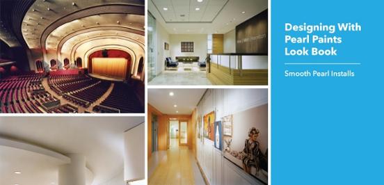
Designing With Pearl Paint

Smooth Pearl, Pearl Interior Paint

Designing With Pearl Paint

Designing with pearl paints can add an unexpected element to your spaces that other products such as wall covering or eggshell paints can’t. Pearl paints, depending on the product, can also offer other benefits that metallic paints cannot. Let’s explore the benefits.

Download our Designing With Pearl Paints Look Book.

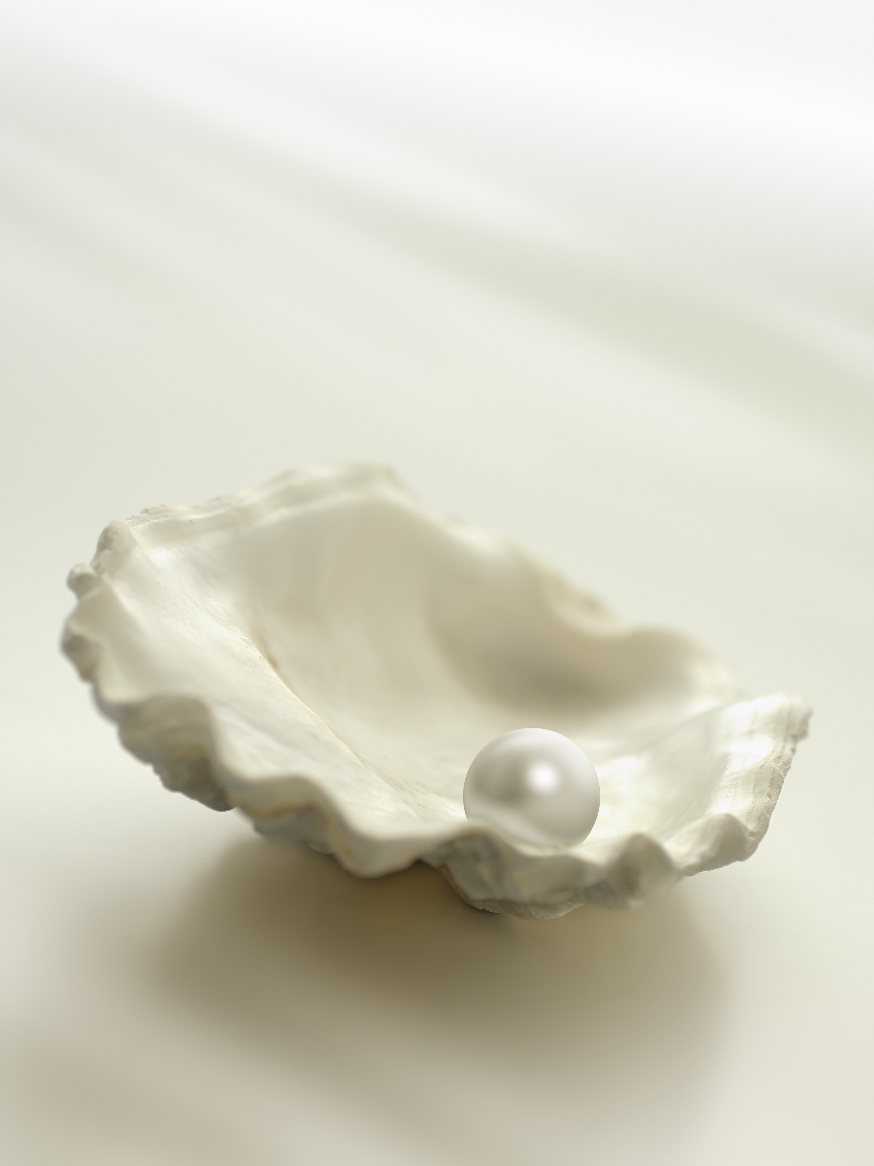
pearl in an oyster shell

Why Would You Choose a Pearl Paint?

If you’re looking for a finish that adds a little something extra in your space that an eggshell or wall covering simply can’t achieve, a pearl paint may be the answer for you. Pearl finishes play beautifully with lighting elements, adding special features to your walls when eggshells and wall covering wouldn’t. Often times metallic paints can’t get as vivid as pearl paints and certainly can’t get very light either. If you’re looking for a pure white but want to up the sophistication with your lighting elements, a pearl finish may be a great option for you. If you’re looking for a vibrant corporate color to up the branding in your space you may also find that the pearl paints can meet that need as well.

Pearl finishes add a level of sophistication and sparkle to your designs without overpowering your spaces. Added bonus, they also are the cleanable and durable option when high traffic solutions are being considered.

Added Benefits of Pearl Finishes

Because pearl finishes often require a protective clear top coat they tend to be more cleanable and durable (like this smooth pearl finish), saving you, your firm and your client money and headaches.

Usually a more subtle and sophisticated appearance than metallic paints or decorative wall coverings, pearls can fit in with more designs without becoming overpowering.

Smooth Pearl Paint

Recap

Why would you choose a pearl paint?

  • Looking for a decorative finish that sparkles, but need a vivid or light color
  • Need a cleanable and durable solution
  • Looking for a wall solution that accentuates directional lighting
  • Don’t want a finish that will take over the space
  • Need a finish that makes a statement, but isn’t overpowering
  • Wall covering can’t reach the aesthetic you are looking for
  • Metallic finishes feel too cold or heavy for the space you’re designing
  • Don’t have the budget for wall covering

Download our Designing With Pearl Paints Look Book below!

Get Your Pearl Paints LookBook

Create a Perfect Mid Century Modern Interior

Designing a Mid Century Modern Space

From Mad Men to NeoCon 2016 in Chicago, Mid Century Modern influence is everywhere in the interiors business. Looking to design your own mid century modern interior space? Whether you’re looking for commercial or residential, here’s the essentials.

Get your own Mid Century Modern color palette here.

Mid Century Modern Interior Eames Chairs

Key Features of Mid Century Modern Design

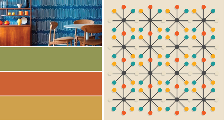
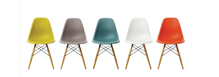
A key feature of mid century interiors is the classic (and famous) Eames furniture and furniture with clean simple lines. Furniture from this era can be identified by the straight clean lines complimented with smooth curves and a typically wooden construction. Pair this with statement lighting (artichoke pendant, anyone?) and graphic patterns to really hit home. This can be done in a number of chic ways. For a lobby or waiting room design try choosing furniture featuring minimalist design with sleek lines and very little features. Go with a bold color like tangerine to spice it up. Pair this with a graphic rug or pillows in one of the era’s popular patterns, such as the atomic pattern you can see below.

The Color Scheme

The Mid Century color scheme is perhaps the most recognizable nod to the era, so make sure to pay extra attention to the color palette you’re choosing for the job in order to create the perfect space. The mid century color scheme often featured darker neutral tones and saturated accent colors. Color has the ability to transport us to different times and places, so if you’re looking for the 60’s vibe, make sure to study up on the chic colors used. Some of the most popular colors from this era are Avocado, Mustard and Tangerine. These colors were used throughout interiors as well as the fashion world, from walls and appliances to skirts and textiles. Don’t be afraid to splash these paint colors on your walls, paint is one of the easiest ways to transform a space. Get your own Mid Century Modern color palette below (for free!).

Mid Century Modern Color Scheme

Paint Your Way Out of a Corner

The Benefit of Using Premium Paints

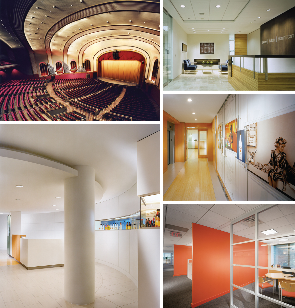
The British School. An active space with premium paint.
The British International School in Chicago, Il. And active space perfect for premium paints.

To many, paint is simply color, a convenient way to bring the elements of a space together and unify them. It’s a last minute decision made after spending hours and hours pouring over lighting, flooring, case goods and furniture systems– those limelight stealing prima donnas. Why do we leave paint decisions for so late in the design process? Is it because paint is boring? Maybe if paint had a better story to tell than simply providing flat color, it might feel more vital to the success of a space. What if paint could wrap architectural details in shimmering pearlescent effects? What if paint could have engaging textures or metallic hues? What if paint could provide protection for walls? The good news is that paint can have all of these characteristics and more: Welcome to the world of Premium Paint.

Get our scrub rating guide here to help you determine what paint is right for your project.

If paint is going to attract designer’s attention like lighting and furniture, it needs an exciting look, it needs to be tough, and it needs be low emitting. The local hardware stores are full of paints that look great but easily wipe right off the wall–not exactly practical for commercial interiors. There’s plenty of durable paints to choose from, too–most of which are so volatile they’ll have the Sierra Club picketing your job site. And of course there are low emitting paints that can’t be cleaned and need constant repainting–which kinda’ defeats their purpose. Only great looking, long lasting, low emitting paint can truly be called premium and earn a higher slot in our design process.

Because paint is often viewed as a commodity, many designers aren’t aware that better options and premium paints exist. The difference between premium paint and store bought paint is as pronounced as the difference between type 1 and type 2 vinyl. You wouldn’t specify type 1 vinyl for an active commercial interior, it would be trashed before the move-in was complete. Specifying regular paints for high-traffic areas is just as fruitless yet we do it all the time.

Dig, if you will, a picture: You’ve completed a new space, it’s opening day and every aspect of the project is pristine. Almost. The walls, corridors and common spaces where you specified regular paint are full of scuffs and kick marks from the move-in process. These walls can’t be cleaned and already need repainting. Oh, and the client is not thrilled. We’ve all painted ourselves into this corner before, but specifying premium paints will get us out of it. Premium paint like Scuffmaster is 10-45x more durable than regular latex paints. That increased level of performance means walls that withstand nicks and chips, and kick marks that wipe off walls without burnishing them or needing a costly touch up.

Scuffmaster Premium Paints. Eight finishes. Endless possibilities.
Just a few of Scuffmaster’s many premium paints.

So that’s the practical side of premium paint, now for the fun side. Imagine radiant metallic paints, envision coatings with textures that echo other elements from the space, picture glossy drops of color creating a fresh, dewy appearance. Premium paints can achieve all of this while maintaining VOC levels low enough to qualify for LEED credits. Yes, premium paints are more expensive (doing it right the first time always is) but your projects deserve premium paint and premium paint deserves a higher place in your design process (if you leave it until the last minute it can get VE’d out). So as you are working, be aware that paint can be so much more than just solid color. and better paint like Scuffmaster is there, waiting patiently for a lead role in your next project. Get our scrub rating guide here to help you determine what paint is right for your project.

Get Your Scrub Rating Guide