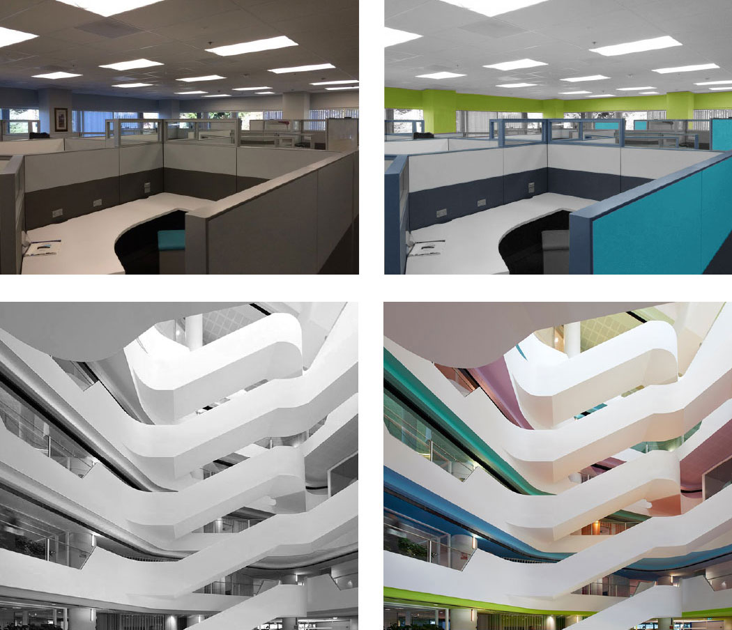




The advantages of using premium paint in high traffic areas.
By now most of us have accepted that doing things right the first time–even though it costs a bit more initially–saves time and money in the long run. That old chestnut seems particularly suitable when designing and building things, that’s why it’s always been the primary reason we make our paints so tough. Remember, the big expense on any painting project isn’t paint, it’s labor. And if you are always repainting because you went cheap on paint for an active interior, you’re going to get creamed on repainting costs. Use a better paint up front, and the kick marks, bag marks, hand prints, and scuff marks that have the painting crew out every other month, can be wiped right off with simple household cleaners instead.
Get our scrub rating guide to help you decide which paint is best for the project.
There’s another big cost to regular repainting that I wanted to talk about today, the cost to the environment. It’s important remember that more painting means more manufacturing, more travel, more clean-up, more off-gassing, more VOCs. That’s not the direction any of us want to see things go. Better you should use a quality low-emitting coating (there might be one I could recommend) and save money on repaints while saving your corner of the planet.
Take a look at the installation below. This project had been up for just 3 months when we paid a visit. It’s located in a busy, mixed-used building in the heart of Minneapolis’ vibrant North Loop neighborhood. Home to restaurants, shops (maybe even a few shoppes), a salon, and enough upscale lofts to let you know you’re in a properly gentrified neighborhood, this building sees a lot of people traffic. The corridors and common areas of the building provided a great test for Scuffmaster; one side was painted in our freakishly strong Armor finish while the other side was painted with store-bought residential paint. I’m sure both sides looked great when they went up, but after a scant 90 days, the regular paint is looking rough and in desperate need of a costly makeover. Not a great first impression if you’re the building owner attempting offload expensive lofts.
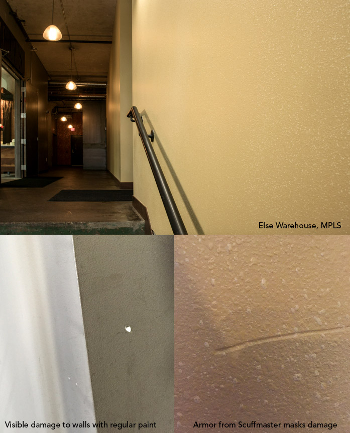
The Armor side of the corridor can take a beating without going to pieces while regular paint highlights the grime, chips, scuffs, and dings. I’m guessing there was a great case to be made for both products at the time they were being specified, but 90 days in, which paint do you think the owners would rather have on all their walls? Get our scrub rating guide below to help you decide which paint is best for the project.