



It’s that time of year again – time for all of your favorite paint companies and color labs to choose their favorite 2017 color trends. Color us excited.
We put a ton of effort into researching our favorite color trends each year; inspired by images across the world, runways, interiors new and young, and (of course) nature. Every year we make sure our collection is full of beautiful rich colors that can stand the test of time (nobody wants to paint a 3000 sqft. project with a color that is going to be dated in 2 years). Scroll through to see some of our picks for 2017 color trends.
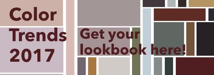
Get our 2017 color trends lookbook here.
This hint-of-blush is the perfect tone to use when looking for a soft neutral. We definitely saw this color coming when we chose a similar shade for our Fall ’16 colors.
Do beautiful rich gold tones ever go out of style? We’re loving this shade for 2017. Try it out in a bold metallic finish.
Pearly whites are the go-to for many designers, and for good reason. This year we see white becoming more of an accent, with dusty blush tones being used more for neutral areas. Check out some great pearl whites here.
This deep chocolate with a hint of red tone is a gorgeous deep neutral, adding some rich color to your interiors.
You may have seen by now that Pantone’s Color of The Year is Greenery. Whilst not as bright, we are also feeling inspired by nature and the changing world around us for 2017. A deeper, more subdued shade of green is on our list for this coming year. This beautiful olive can almost get away as a neutral tone. How will you use it?
By the way – did you know humans can see more shades of green than any other color?
This deep merlot has some staying power; it’s sure to be a classic and has us asking for another glass of wine (yes, please!).
Deep rich shades combined with soft tones are our go-to combinations for 2017. This evolved shade of a deep emerald with a cool blue tone is one of our favorites in this collection. We can’t wait to see how you use it.
Find our colors from this palette here.
This is only HALF of our palette for 2017 color trends. Check out the rest in the lookbook below! We can’t wait to see how you combine these colors.